Work
/ Divinus /
University Projects
/ Dungeons and Dragons Classics / Typographic Arcana / Remote Control / DTC Animosity / Metallic Ratio / Cumbria Wildlife / Lost In Translation / Play TV Channel / Eden Brew Co. / The Ignorance Project / The Year is 1989 / Pleasurelands / Pencil to Pixel / Red Star Over Russia /
Divinus
Profile Icons and Logo for gaming team Divinus, they requested a black, red colour scheme with a theme related to the Valkyrie of mythology. I also made a display font for their names. The design incorporates a spear, shield and wings associated with the Valkyrie.
Dungeons and Dragons Classics
University Project.
50th anniversary collectors editions of Dungeons and Dragons adventure modules, Tomb of Horrors; White Plumb Mountain; and the Village of Hommlet.
50th anniversary collectors editions of Dungeons and Dragons adventure modules, Tomb of Horrors; White Plumb Mountain; and the Village of Hommlet.
Typographic Arcana
University Project.
A series of Major Arcana Tarot cards illustrated by fonts and typographic imagery, trying to replicate the themes and meanings of the cards using only shapes and forms withing the type face I thought was best represented by the cards meaning. The colour palette derived from the bold colours used in the Rider-Waite tarot deck.
A series of Major Arcana Tarot cards illustrated by fonts and typographic imagery, trying to replicate the themes and meanings of the cards using only shapes and forms withing the type face I thought was best represented by the cards meaning. The colour palette derived from the bold colours used in the Rider-Waite tarot deck.
|
|
Remote Control
University Project.
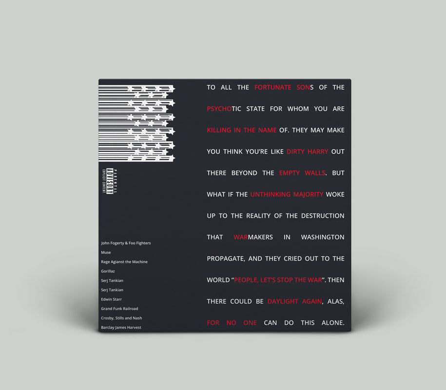
A cover for a fictitious compilation album housing various antiwar songs.
A cover for a fictitious compilation album housing various antiwar songs.

|
|
DTC Animosity
University Project
A display font for a fighting game of the same name being developed by second year Game Design students at the University of Cumbria.
A display font for a fighting game of the same name being developed by second year Game Design students at the University of Cumbria.


Metallic Ratios
University Project.
A book on the Golden Ratio and related ratios. The focus on the book was to show the mathematical basis for the ratio and highlight it's applications. The book included extend pages that folded out, mainly used for the chapter pages.
A book on the Golden Ratio and related ratios. The focus on the book was to show the mathematical basis for the ratio and highlight it's applications. The book included extend pages that folded out, mainly used for the chapter pages.
Cumbria Wildlife
University Project.
A series of infographic banners for the wildlife charity Cumbria Wildlife.
A series of infographic banners for the wildlife charity Cumbria Wildlife.
Lost In Translation
University Project.
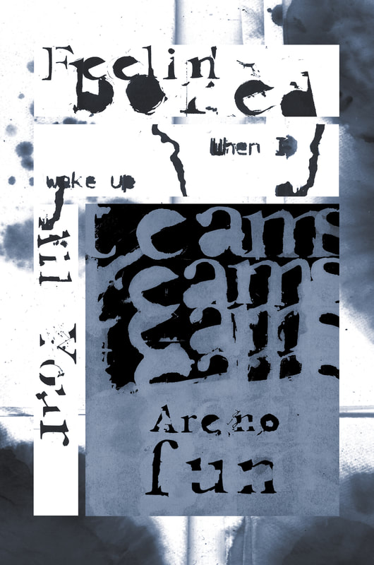
Final comic page to go into the Lost In Translation comic that the University of Cumbria will be selling at Lakes International Comics Festival 2019. The concept of the comic was to experiment with typography and layout. We were each provided with a mistranslated Bob Dylan song lyric as the copy for our pages. Below the page is a collection of the experimentation with type and ink that I did.
Final comic page to go into the Lost In Translation comic that the University of Cumbria will be selling at Lakes International Comics Festival 2019. The concept of the comic was to experiment with typography and layout. We were each provided with a mistranslated Bob Dylan song lyric as the copy for our pages. Below the page is a collection of the experimentation with type and ink that I did.
October 2019 / back to top
Play - TV Channel Identity
University Project.
The stings and branding for a fictitious Gaming News TV channel called "Play". The service would be split into three audiences and gamify the service between these audiences by creating Teams Red, Green and Blue. Red would be people focused on modern gaming, Green retro gaming and Blue would be focused on developers and promote friendly competition between each of them.
Some of the stings use footage taken from game trailers as backgrounds these just to show the overlay in action.
|
|
|
|
|
|
|
|

|
March 2019 / back to top
Eden Brew Co.
University Project.
A series of beer cans designed in a competition for Eden Brew Co. in Cumbria. My designs were focused on the theme of electromagnetism and how it manifests in light and magnetism. I got to experiment with macro and slow shutter photography in this project to produce imagery.
A series of beer cans designed in a competition for Eden Brew Co. in Cumbria. My designs were focused on the theme of electromagnetism and how it manifests in light and magnetism. I got to experiment with macro and slow shutter photography in this project to produce imagery.
January 2019 / back to top
T.E.D Talk Book- "The Ignorance Project"
University Project.
A blad of a fictitious book based on the TED Talks of Hans and Ola Rosling.
A blad of a fictitious book based on the TED Talks of Hans and Ola Rosling.
December 2018 / back to top
The Year is 1989
University Project.
An A2 broadsheet on the events of 1989, in which I focused on the Fall of The Berlin Wall and The Tiananmen Square Massacre. We were limited to a black, white and one colour of our choice (and were permitted to use various tonal values of this) for the palette and the broad sheet was required to fold at least three times.
An A2 broadsheet on the events of 1989, in which I focused on the Fall of The Berlin Wall and The Tiananmen Square Massacre. We were limited to a black, white and one colour of our choice (and were permitted to use various tonal values of this) for the palette and the broad sheet was required to fold at least three times.
November 2018 / back to top
Pleasurelands
University Project.
For this project I had to design three sets of splash pages and turn pages for a given copy. Each set had to be designed on a 6, 9 and 11 grid page respectively. This project was to teach us how to use grids in the construction of a design piece.
For this project I had to design three sets of splash pages and turn pages for a given copy. Each set had to be designed on a 6, 9 and 11 grid page respectively. This project was to teach us how to use grids in the construction of a design piece.
October 2018 / back to top
Pencil to Pixel
University Project.
An event poster that was an exercise in developing a hierarchy of information.
An event poster that was an exercise in developing a hierarchy of information.

Red Star Over Russia
University Project.
A triptych of designs to experiment with type and hierarchy of information layouts in different shaped documents.
A triptych of designs to experiment with type and hierarchy of information layouts in different shaped documents.
Lovecraft Stamp Collection
A-Level Project.
A stamp collection themed around the works of H.P. Lovecraft's Dagon; Call of Cthulhu; and At the Mountains of Madness. Each story having 2 stamps presented in their own folio which contains an exert from the respective story. The folios would be packaged inside a hollowed book.
I also developed a display font for this piece.


Winter 2015 / back to top
Chaos and Order
A-Levels Project
A Typographic experimentation project were I had to produce a typographic art piece with the font Rockwell
A Typographic experimentation project were I had to produce a typographic art piece with the font Rockwell

December 2014 / back to top
Abstract Image Book Covers
A-Levels Project
We had to produce an abstract book cover with only abstract marks or found textures, and a list of book titles and authors that we were not allowed to research.
I went a bit excessive and produced three finished pieces rather than the required one.
We had to produce an abstract book cover with only abstract marks or found textures, and a list of book titles and authors that we were not allowed to research.
I went a bit excessive and produced three finished pieces rather than the required one.